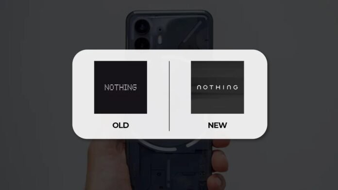
London-based tech brand Nothing has ignited widespread discussion online after unveiling a new logo on X, accompanied by the caption “Getting ready to make history.” The teaser consisting of a clean, minimalist wordmark marks a notable departure from the unique pixel-style visual identity that has defined the company since its inception in 2020.
Since its launch, Nothing built its brand around a distinctive dot-matrix aesthetic and unconventional designs that set it apart from rivals in a crowded smartphone market. The original pixel-inspired logo and design language were central to the company’s identity, emphasising playfulness and creative expression rather than corporate uniformity.
A Move Toward a More Mainstream Look
The new logo teasers show a smooth, sans-serif wordmark that appears more conventional and commercially oriented than Nothing’s previous visual style. Unlike the experimental dot font that helped the brand stand out, the revised design leans into simplicity and broader recognisability a choice that many interpret as a step toward mainstream appeal.
Nothing’s official X post did not include further details on whether this design is final or if it’s part of a full rebrand rollout. The absence of product references suggests the focus for now is on repositioning the brand identity itself rather than announcing a specific device or service initiative.
Fan Reactions: Divided and Vocal
Response from the online community has been mixed. Some fans praised the move toward cleaner branding, viewing it as a natural evolution as Nothing expands globally and broadens its product ecosystem. Others, however, expressed concern that distancing itself from the pixel motif could weaken the distinctive personality that originally drew attention to the brand.
Already, comparisons have surfaced between Nothing’s new wordmark and other corporate redesigns with some users pointing to a resemblance to Jaguar’s recent minimalist logo. While this was largely tongue-in-cheek, it underlines how strongly visual identity influences public perception in tech branding.
What It Could Mean for Nothing’s Future
Design analysts say that shifting to a simpler, more traditional logo often reflects a broader strategic shift moving from niche innovator to mainstream contender. For Nothing, this could hint at ambitions beyond smartphones, potentially aligning with other product categories or experiences where a less quirky and more universally accessible brand aesthetic is preferred.
This evolution also fits into a wider industry trend: several tech brands have recently embraced minimalist identities to signal maturity, stability, or entry into premium markets. While such rebrands can make a company more universally recognisable, they may also risk alienating core fans who valued the original ethos.
Looking Ahead
Nothing has yet to confirm whether this logo change will be accompanied by new products, services, or a full corporate rebrand strategy. For now, the teaser serves as a clear message: the company is ready to redefine itself, even if that means moving away from the visual quirks that first captured attention. As discussions continue across social media and design communities, the industry will be watching closely to see how and whether Nothing integrates this new identity into its broader ecosystem.


